This week was spent using the CLC software to visualize and analyze genomic data from some given samples (not data from our sourdough starters).
Working with CLC wasn’t too bad. It took me around 30-40 mins to work through all the graphs and absorb what I could from the data. Of course, that’s not including the time I had to wait for the data to be uploaded and whatnot! Personally, I really enjoy looking at graphs and statistical data like this so I thought most of the stuff done using the CLC software was pretty cool.
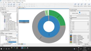
This graph above represents the amount of OTU’s in the samples that correspond with specific groups or types of bacteria. In this case, OTU’s were only defined if they were 97% or more similar to the reference data used. The inner ring shows that 99% of OTU’s in the sample come from bacteria and then the outer ring shows, what I believe to be the different phylum of bacteria that constitute all the bacteria in the sample.
When more rings are added to the graph (not pictured) it is important to understand just how many different species of bacteria are present in the sample. By the time the last ring is broken up there are well over 100 different pieces to represent each individual species. The diversity is staggering!
I have decided to keep the same three questions from last week because I think they’re all super interesting questions that could be answered using our data.
Does adding fruit, such as a banana, change the microbial composition of a starter?
What sorts of “outliers” will be discovered? What kind of unique or interesting microbes will be found in some classmates starter samples?
Will all of my classmates control cups be gnomically very similar? Or will they be different based on the environmental conditions they grew in while in our homes?